
Crafted from 165 years of Old World techniques, the story of Fiorucci can be traced back to the 1850s. Today, all of their Italian meats are crafted using the same centuries-old techniques and recipes, and each Panino is still rolled by hand.
With Fiorucci looking to accelerate distribution in America, our international roots and knowledge of the market made us the perfect partner to update their brand identity and package design to better appeal to American meat lovers.
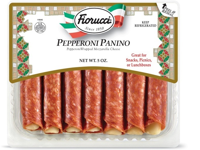
BEFORE

AFTER
Our strategic branding approach took cues from Firoucci’s Italian heritage, and brought the brand back to basics. Trading an outdated, heavy mosaic background for a bright and modern artisanal butcher paper pattern—the updated design harkens back to Fiorucci’s legacy of using time-honored, crafted techniques to produce Italian meats of unmatched quality.
BEFORE
AFTER
The Fiorucci logo also got a facelift, preserving the established equity of the brand identity with refreshed flair, including updated typography and a sleek, modern homage to its roots “d’Italia”.
Tasty hand-rolled Paninos tempt you through a transparent window, creating an instant desire to make Fiorucci part of your next gathering.
As they say in Italy— “MANGIA!”