Inspired by a traditional, regional French dish made with fresh cheese and fine herbs, Boursin’s line of signature varieties is found in over 35 countries across five continents.
But, as the Boursin family of cheeses matured, it began to grow apart with varying styles that undervalued its quality.
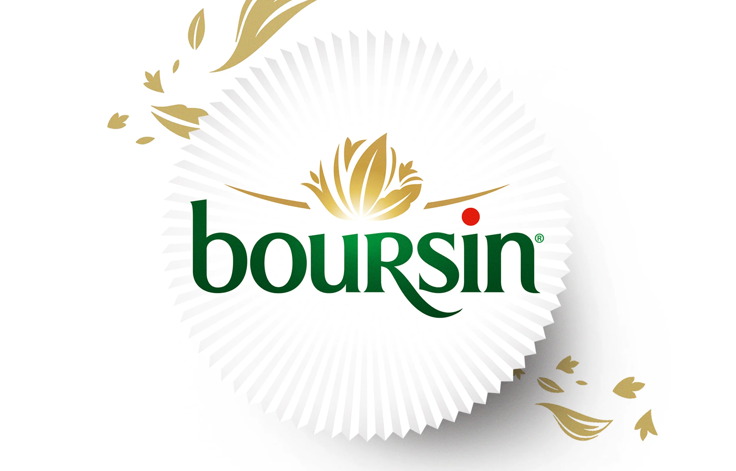
When the delicate, iconic silver wrapper caught our eye, it was the natural source of inspiration to give the Boursin brand identity a face-lift. Reinterpreted graphically, the distinctive “corolla” frames an updated logo.

Mouthwatering representation of ingredients present a unified product line – delivering a look as distinctive as its taste.
The use of the silver corolla as the defining asset for all Boursin visual communication ensures the brand’s consistency and beauty rollout seamlessly across the brand’s many global regions.

Increased strength of variety color on-pack eases navigation, and coupled with the new corolla-inspired logo, the design creates beautiful brand blocking on shelf.
With its updated brand identity and package design, Boursin is recapturing the eyes and tastebuds of the many Boursin-lovers throughout the globe—inviting everyone to unwrap inspiration.